Introduction
The date picker displays a calendar box where customers can pick any date they want.
You can also choose a date range and charge a per-day cost.

Benefits, Features & Use Cases
It's great for bookings, schedules, pickup dates, general info, etc.
- Let your users schedule or book your services
- Set an appointment with your customers
- Charge for a per-day cost for a range of dates
Watch It In-Action

How to Activate & Use This Feature
To add a Date Picker, first click on the "+Add Element" button

Then click on "Date Picker"

Settings & Options
First thing, you can add a "Title". It'll be shown on the frontend.

You can set a default date, for example, today's date.

Date Type
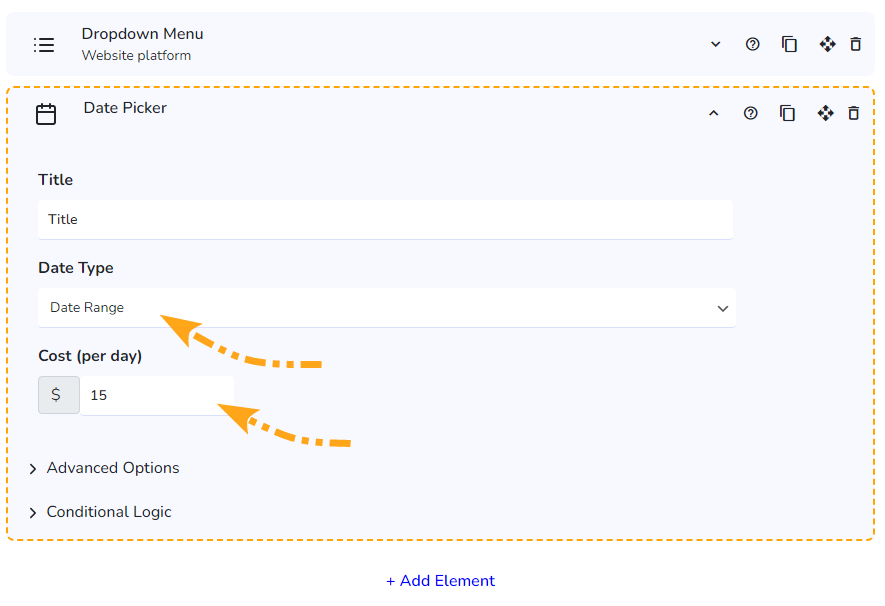
Choose between two types of Date Picker: Single Date Picker and Date Range Picker

Single Date
The single date picker allows you to select one specific date. This is useful when you need to choose a single date for an event, appointment, or deadline. Once a date is selected, the picker will close, confirming your selection.

Date Range
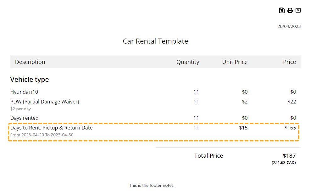
Introducing the Date Range feature, designed to calculate pricing based on a specified date range. This versatile tool lets you set a daily rate for your service, providing a clear and simple pricing structure.
 Alternatively, you can harness the power of conditional logic to create custom pricing models tailored to the number of days the frontend user selects. Streamline your pricing strategy with this dynamic and user-friendly feature.
PDF Quote View

How to disable specific dates
Advanced options provides increased control over how users interact with the date picker in the Stylish Cost Calculator. By customizing these settings to match your specific needs, you can create a more streamlined and user-friendly experience for your customers.

- Disable Weekends: This option allows you to make weekends (Saturday and Sunday) unselectable in the date picker. This is particularly useful for businesses that do not operate during the weekend. By preventing customers from selecting these days, you can ensure that all appointments or reservations made through the calculator align with your business hours.

- Max Date: Similar to the Min Date option, the Max Date option sets the latest date that can be selected in the date picker. This is useful for limiting the range of selectable dates to a specific period. For example, if you are running a promotion that ends on a certain date, setting a maximum date ensures that customers cannot select dates beyond the promotion period.
- Min Date: Sets the earliest date that can be selected in the date picker. It helps in preventing users from selecting dates in the past or any date before a particular time point. For instance, if you are scheduling an event that can only take place after a certain date, setting a minimum date ensures that customers cannot mistakenly choose an inappropriate day.

- Default Date: This option sets a pre-selected date in the date picker when the user first sees it. It can be used to guide the user's selection towards a preferred date, or to provide a suggested date for certain actions. By providing a default date, you can make the date selection process more user-friendly and efficient.
- Disabled Dates: This option allows you to specify individual dates that cannot be selected in the date picker. This is handy for blocking off specific days that are not available for appointments or reservations, such as holidays or days when your business is closed. By disabling these dates, you can provide a more accurate representation of your availability and prevent scheduling conflicts.

Additional Information
Related Features
Element: Quantity Input Box https://designful.freshdesk.com/support/solutions/articles/48001081164-element-quantity-input-box
Element: Text/HTML Field https://designful.freshdesk.com/support/solutions/articles/48001207057-element-text-html-field
Was this article helpful?
That’s Great!
Thank you for your feedback
Sorry! We couldn't be helpful
Thank you for your feedback
Feedback sent
We appreciate your effort and will try to fix the article

